The California Housing Dataset Is Mostly a Geography Lesson
A practical look at the California housing prices dataset: what the rows actually mean, why the target is capped, and what this dataset is good for teaching.
The California housing dataset has the perfect shape for a machine-learning tutorial.
It is small enough to load quickly, real enough to feel less toy-like than synthetic data, and familiar enough that the target makes immediate sense. Everyone understands the idea of predicting housing prices.
But the name is misleading in a way that actually matters.
The dataset looks like a home-price dataset, but it is not house-by-house sales data. It is not current market data. It is not a Zillow clone waiting to happen. It is a 1990 census-era collection of area summaries, and the most useful thing it teaches is not “how to predict California home prices.” It teaches how quickly a regression problem becomes a data problem.
I used the StatLib / scikit-learn version of the dataset for this post because it is easy to reproduce without Kaggle credentials. Kaggle mirrors are useful if you want a CSV in the browser, but the canonical version in scikit-learn is enough for the main lesson: before modeling, understand what the rows actually are.
The geography is visible before any model shows up. That is the first clue that this is not just a clean tabular regression exercise.
Start with the unit of analysis
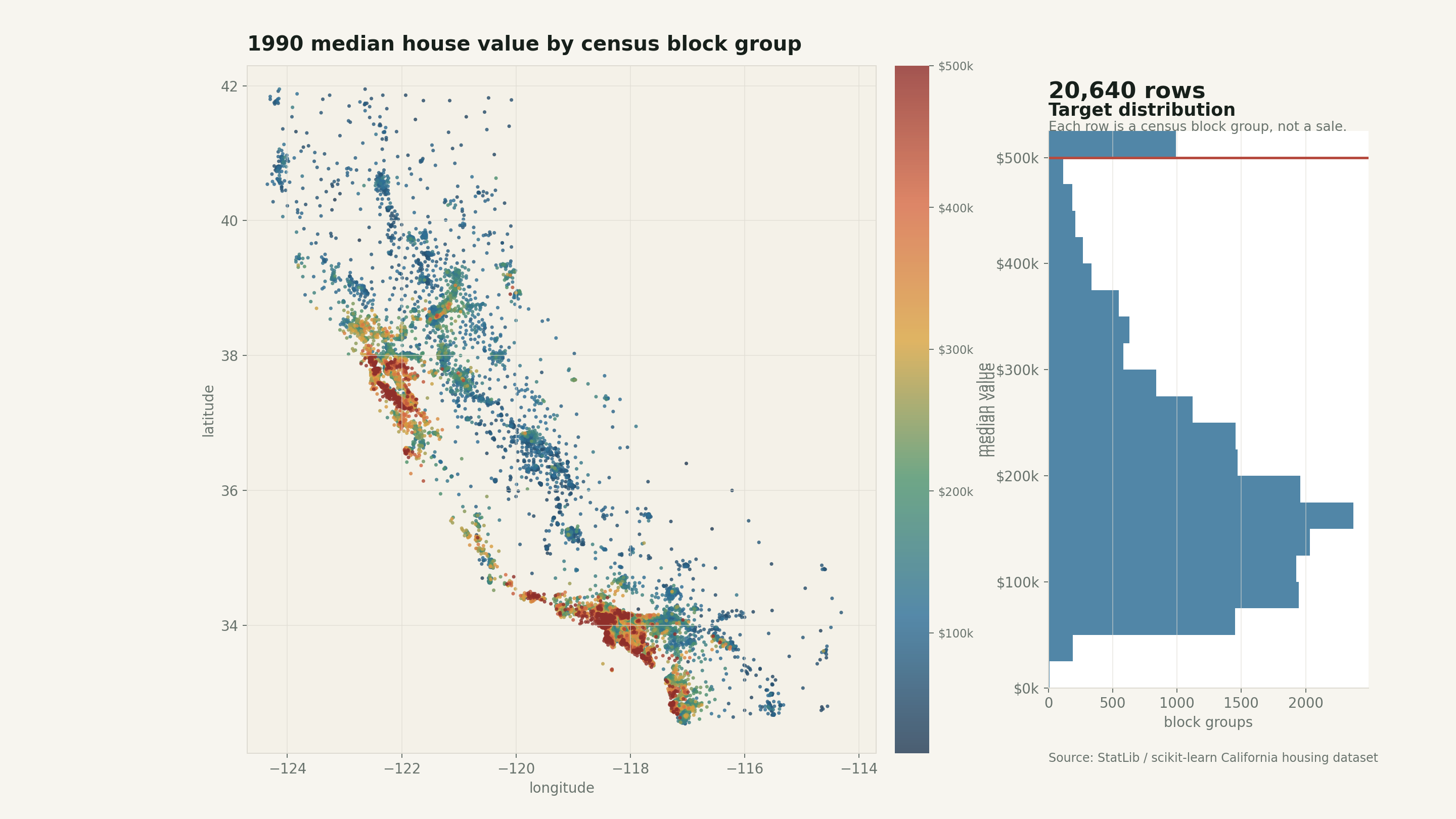
The most important correction is simple: one row is not one house.
In the scikit-learn version, the dataset has 20,640 rows and 8 numeric predictive attributes (scikit-learn, 2026). The description traces it back to 1990 U.S. census block groups, where a block group is a small geographic area rather than an individual property (scikit-learn, 2026).
That changes how I read every column.
MedInc is median income for a block group. HouseAge is the median age of homes in that block group. AveRooms, AveBedrms, and AveOccup are averages over households. Latitude and Longitude locate the block group. The target is median house value for the area, expressed by scikit-learn in units of $100,000.
So the row is better read as:
“Here is a small area in California in 1990. What was the median house value there?”
That sounds like a small distinction, but it matters. Aggregated rows behave differently from individual transactions. You cannot reason about a single sale, a single buyer, a single floor plan, or a single listing. You are modeling neighborhood summaries.
That is still useful. It is just a different task than the name suggests.
Here is the quick profile I used while working through it:
| Item | Value |
|---|---|
| Rows | 20,640 |
| Median target value | $179,700 |
| Mean target value | $206,856 |
| Maximum recorded value | $500,001 |
| Rows at the maximum | 965 |
| Median income correlation with target | 0.688 |
Those numbers already tell a story. The median and mean are far apart enough to hint at a right tail. The maximum looks suspiciously round. Income is obviously important, but not perfect. And because the map has coordinates, location is going to do real work.
The target is capped
The strangest part of the dataset is the ceiling.
The maximum median house value is $500,001, and 965 block groups hit that exact value. That is 4.7% of the rows.
That is not a natural market pattern. It is a censoring pattern. The dataset does not tell us how far above the ceiling those expensive areas really went. A block group with a true median value of $520,000 and one with a true median value of $900,000 can both get flattened into the same visible endpoint.
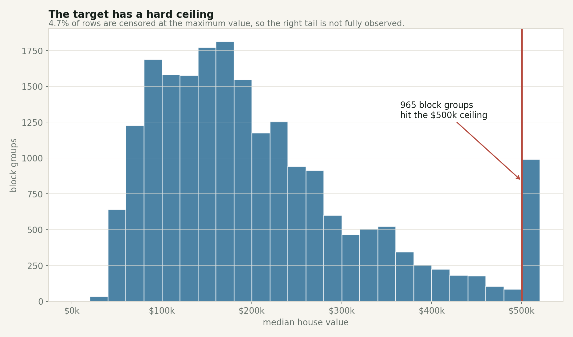
The spike at the far right is not a normal tail. It is a measurement limit.
This matters because the target is what the model is trying to learn. If the high end is flattened, then model errors near the high end are harder to interpret. A prediction of $480,000 for a capped row might look close, but we do not actually know how high the uncapped value should have been.
The ceiling is exactly what makes it a good teaching example. Real datasets often have limits like this. Sometimes values are top-coded for privacy. Sometimes collection systems have maximum fields. Sometimes business logic rounds, clips, buckets, or suppresses values. If you do not check the target distribution early, you can mistake a data-collection artifact for a market pattern.
Income is the obvious first signal
Median income is the feature most people expect to matter, and it does.
In this dataset, the correlation between median income and median house value is about 0.688. That is strong for one variable in a messy real-world dataset. The relationship is visible immediately: higher-income block groups usually have higher median house values.
But the plot also shows why “usually” is doing work.
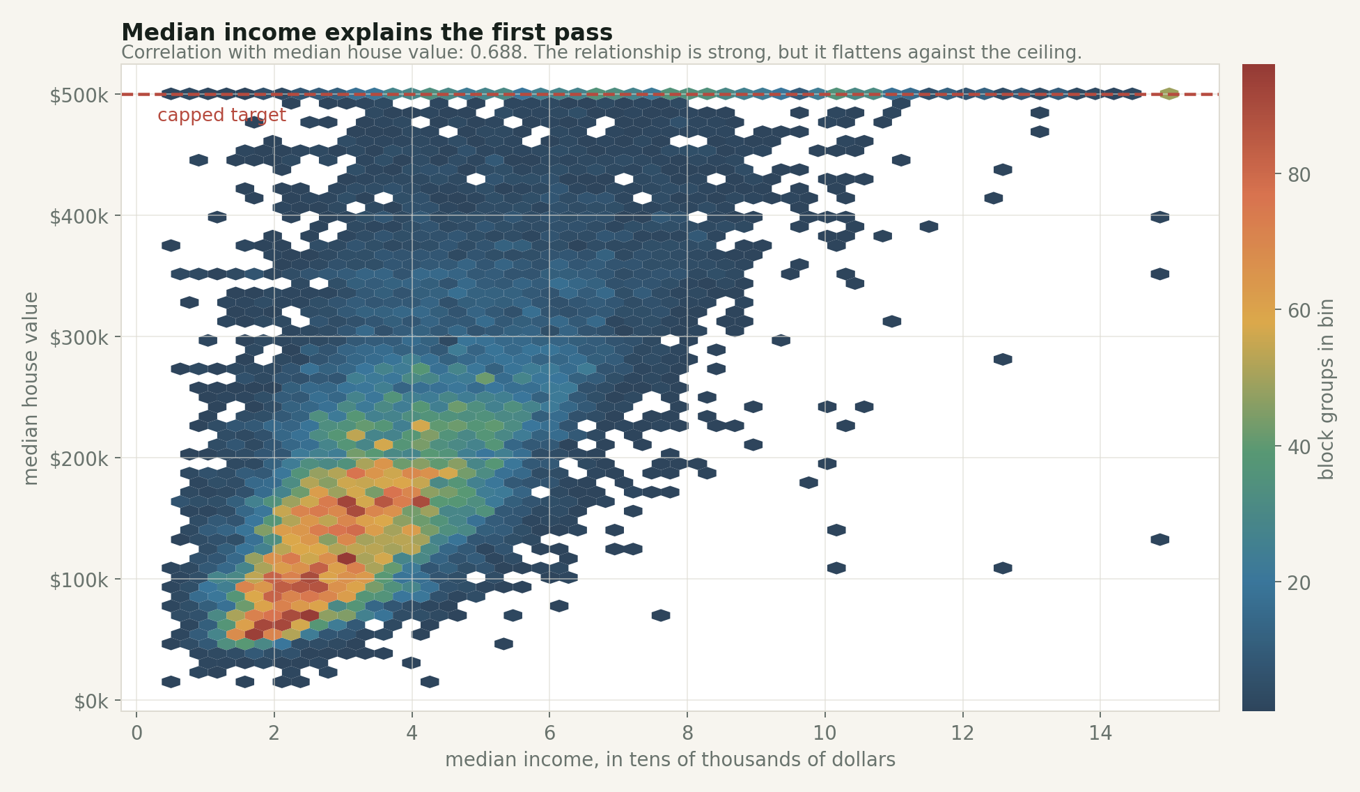
Income is a strong first read, but the ceiling flattens the right side and the spread stays wide.
The highest income quartile has a median block-group value of about $295,250. The lowest income quartile has a median of about $103,950. That is a huge difference.
Still, income is not the whole story. There are moderate-income areas with expensive housing and higher-income areas that do not reach the cap. Once location enters the picture, that spread makes more sense.
This is where I think the dataset becomes useful for beginners. It gives you one signal that is easy to understand, then immediately shows that one clean signal is not enough.
You can start with a naive rule: higher-income areas usually have higher median house values. Then the data forces you to add context: place, housing stock, occupancy, and measurement limits. That is closer to how modeling actually feels.
Location is not just another column
Latitude and longitude look like ordinary numeric features in the table, but they are carrying a lot of structure.
They are standing in for distance to jobs, coastline, climate, local scarcity, commuting patterns, local policy, and a pile of regional history that is not explicitly present in the dataset. A model that uses coordinates is not learning “longitude” in the abstract. It is using geography as a compressed proxy for things the table does not name.
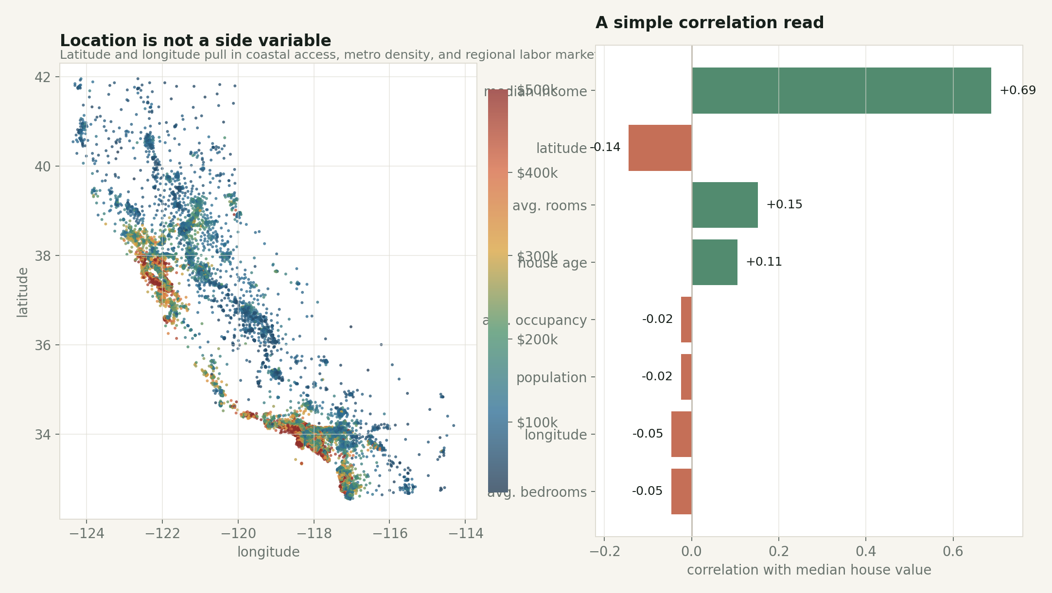
The simple correlation chart understates location. Latitude and longitude are weak as separate linear correlations, but together they carry spatial structure.
This is a good warning about feature interpretation.
If I only look at the correlation table, MedInc dominates and the coordinate columns look modest. But the map says something stronger: the high-value areas are not randomly scattered. They cluster around parts of the coast and major metro regions. A linear correlation coefficient cannot fully capture that two-dimensional spatial pattern.
The animation below makes the income story feel less one-dimensional. As the map steps through income quartiles, higher-income block groups become more common in expensive coastal and metro pockets, but geography never disappears.
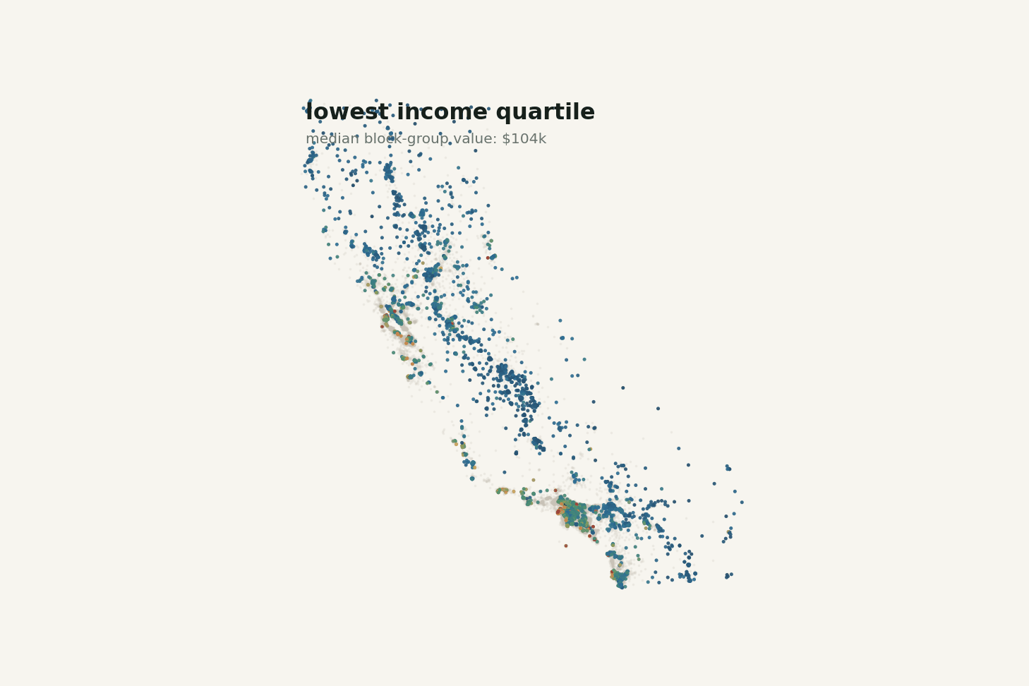
Changing the income band changes the map, but it does not turn the problem into income alone.
This is one of the more useful habits the dataset can teach: when a model improves after adding location, do not stop at “coordinates helped.” Ask what the coordinates are proxying for.
Sometimes that proxy is acceptable. Sometimes it is exactly the thing you need to be careful with.
A baseline model is useful, but not magic
I ran a simple train/test check with two models:
- a ridge regression baseline with scaled features
- a histogram gradient boosting regressor
The ridge model landed around $52,663 mean absolute error and $72,073 RMSE on the test split. The gradient boosting model did better, around $30,807 MAE and $47,380 RMSE.
The boosted model has room to use nonlinear interactions the ridge cannot: income by location, occupancy by location, age by region, and so on.
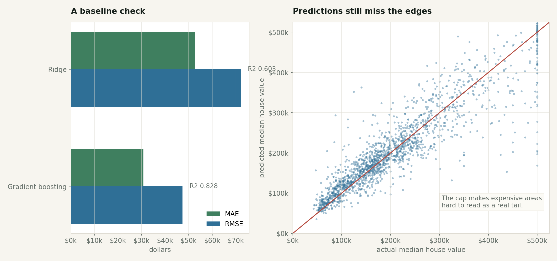
A stronger model improves the baseline, but the expensive edge remains awkward because the target is capped.
The point is not that gradient boosting is “the answer.” The point is that model choice is only one layer of the problem.
If I were using this dataset in a real analysis, I would spend more time on the data questions than the algorithm list:
Is the target capped? Yes.
Are these individual homes? No.
Is this current market data? No.
Do the coordinates act as a proxy for missing social and economic variables? Almost certainly.
Can the model extrapolate beyond the 1990 measurement range? Not honestly.
That is why this dataset is useful and dangerous in exactly the same way. It is simple enough to get a model running in minutes, but real enough to punish shallow interpretation.
What I would use it for
I would use the California housing dataset to teach regression workflow, not to teach housing markets. It is a compact way to practice reading a dataset description, checking target distributions, catching capped values, and comparing a linear baseline to a nonlinear model that can exploit location. What I would not do is treat it as current real estate data, use it for individual home-price prediction, or draw fairness conclusions from it without a lot more context.
The dataset is from 1990. California changed. Prices changed. Lending changed. Zoning fights changed. The modern housing market is not contained in these 20,640 rows.
But as a teaching dataset, it still holds up because it makes the right mistakes visible: the clean table hides aggregation, the continuous target hides a ceiling, and what looks like a model problem keeps turning back into a data problem.
Reproducibility note
The figures in this post were generated from the public StatLib archive used by scikit-learn. The script is in the site repository at scripts/generate_california_housing_article_images.py. It downloads the archive, recreates the scikit-learn-style derived columns, and writes the post images under assets/img/posts/california-housing-prices/.