Why I Picked the Less Accurate Model for Stroke Screening
A stroke screening classifier on a dataset where 95 percent of rows are negative. The 94 percent accurate model flagged almost nothing. The 75 percent accurate model caught four out of five cases. Here is why the second one was the right answer.
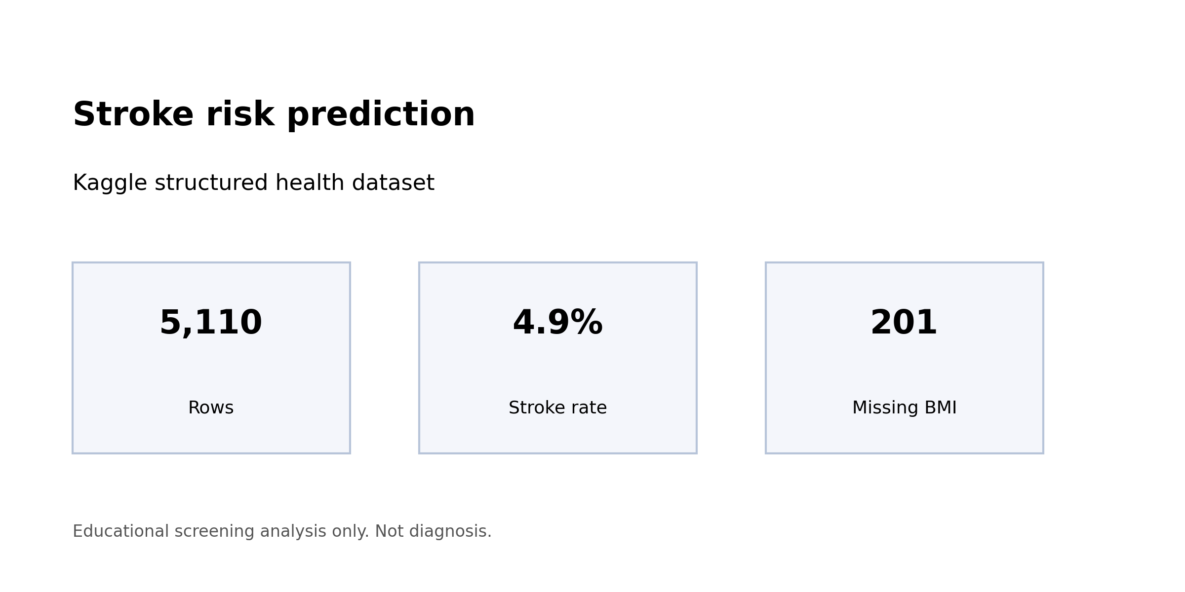
The stroke dataset from Kaggle has 5,110 rows and 249 of them are positive. That is a 4.87 percent positive rate, and it is the whole story.
A classifier that predicts “no stroke” for every single row would be 95.13 percent accurate on the held-out test set. That classifier is useless. It identifies zero of the people who should be flagged. It contributes no information to a screening workflow. It exists entirely to show why accuracy is the wrong metric for problems like this one.
I trained two models anyway, because the interesting comparison is not between a real model and a degenerate one. It is between a linear model that chooses to cast a wider net and a tree ensemble that chooses, despite being told not to, to stay conservative. The simpler model won decisively on the only metric that matters for screening. Here is why.
Start with the base rate
Before anything else, the shape of the target variable has to set the rules.
Of the 5,110 records, 4,861 carry a stroke label of 0 and 249 carry a stroke label of 1. That ratio — roughly 19.5 negatives per positive — is severe but not unusual for rare-event problems in health data. It is severe enough that the majority-class baseline hits 95.13 percent accuracy without learning anything at all, which sets a hard floor on how the rest of the evaluation has to be read.
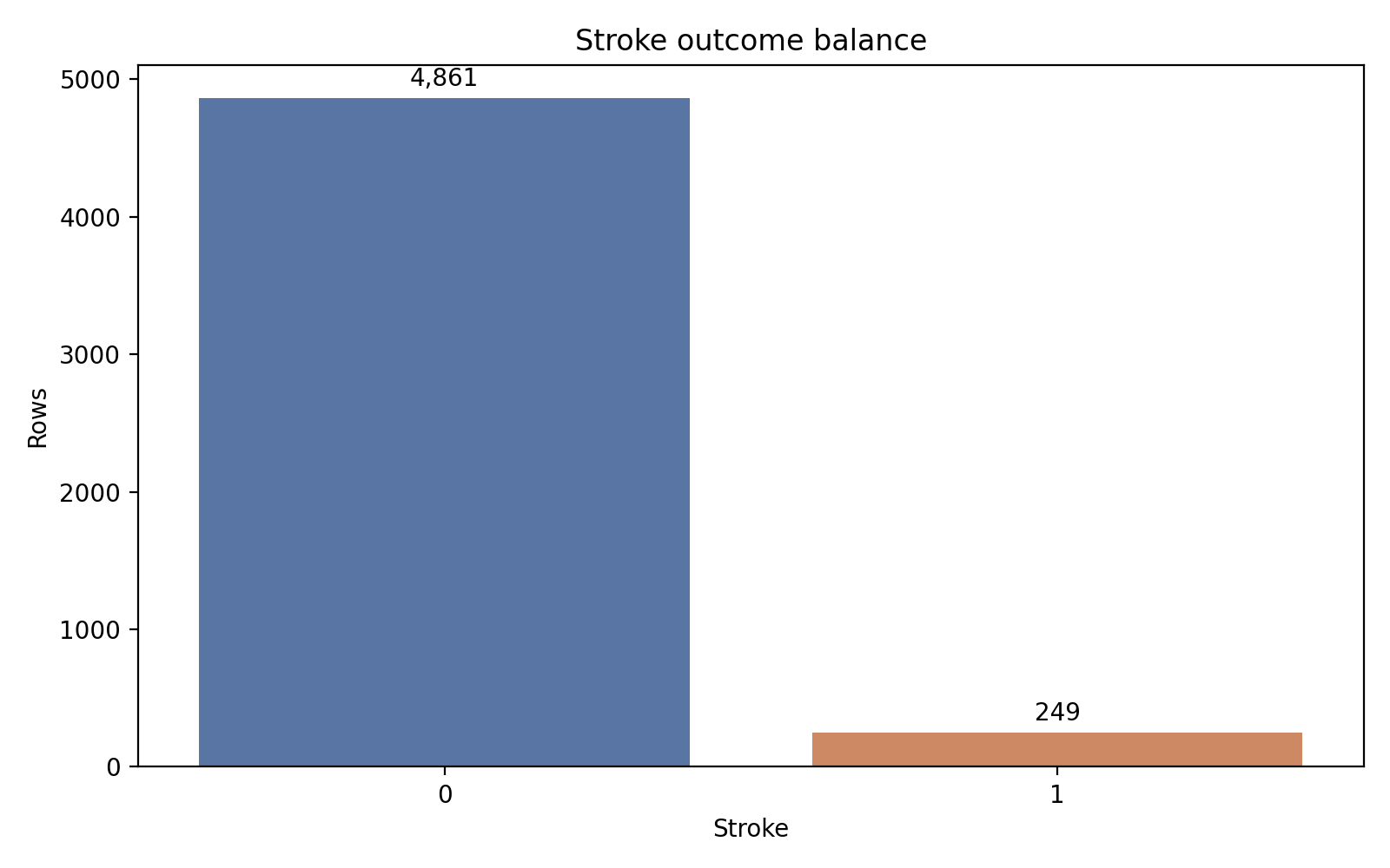
The positive bar is small enough that a trivial predictor clears 95 percent accuracy. That is the trap the rest of the modeling has to avoid.
Once you see that chart, you stop treating accuracy as a headline number. Recall becomes the headline. Recall asks a different question: of the records that actually carry a positive stroke label, how many did the model correctly identify? In a screening workflow where the cost of a missed case exceeds the cost of a chart review, that is the operational question.
Here is the quick profile I worked against:
| Item | Value |
|---|---|
| Rows | 5,110 |
| Positive cases | 249 |
| Positive rate | 4.87% |
| Missing BMI values | 201 (3.9%) |
| Majority-class accuracy | 95.13% |
| Stratified train/test split | 80/20 |
The stratified split is not optional at this prevalence. A purely random split could produce a test set with only 30 or 35 positive examples, enough to make recall estimates swing ten percentage points on a single misclassified row. Stratification holds the positive rate fixed in both partitions, giving the test set approximately 50 positive cases to evaluate against. That is barely enough.
Age is the story, and everyone knows it
The exploratory pass is mostly a sanity check against the clinical literature, and the signal lines up.
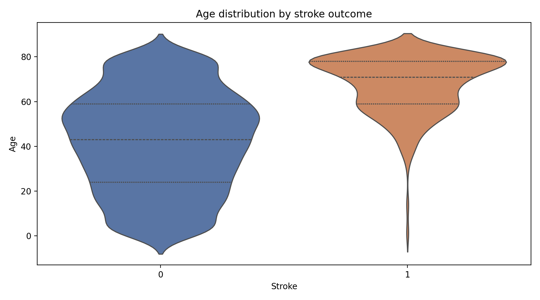
Stroke cases are effectively absent below about age forty and rise in density through the sixties and seventies. This is the INTERSTROKE finding, reproduced on a small public dataset.
Average glucose level shows a similar rightward shift for positive cases, consistent with the long-known relationship between diabetes and cerebrovascular risk. Hypertension and heart disease are both disproportionately represented in the positive class, which is again exactly what the INTERSTROKE case-control study (O’Donnell et al., 2016) reports as a global pattern. BMI shows less clean separation, which may partly reflect median imputation on the 201 missing rows and partly reflect genuine attenuation of the signal in this particular sample.
None of that is surprising. The point of the exploratory pass is not discovery. It is confirming that the features carry the expected clinical meaning before the model runs, so that whatever the model does next is legible in terms the literature recognizes.
Two models, same features, different failures
Both models use the same preprocessing, the same stratified split, and the same class_weight='balanced' setting. The only asymmetry: the linear model gets standardized continuous features, because scale matters for a linear boundary; the tree ensemble does not, because trees are invariant to monotone transformations.
Logistic regression reached 0.800 recall and 0.8437 ROC-AUC on the held-out test set. Precision at the operating point was 0.1481.
Random forest reached 0.160 recall and 0.8124 ROC-AUC. Precision was 0.2963.
The summary is one sentence: the linear model catches four out of five actual positives; the tree ensemble catches about one in six. The tree ensemble’s precision is higher, but at this prevalence the recall collapse is decisive.
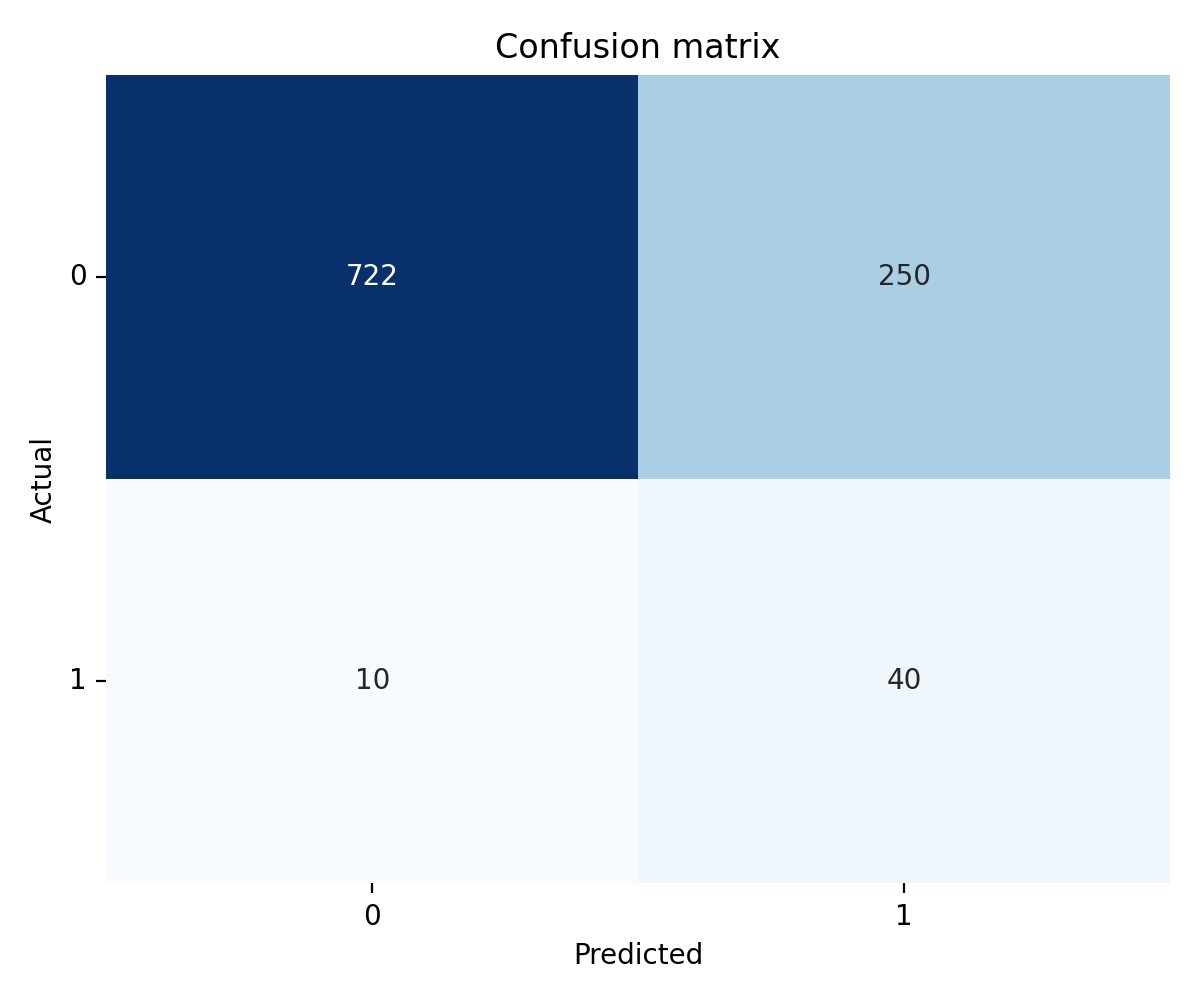
Four out of five actual positives land in the true-positive cell. The false-positive block is large, but it is the price of operating at the recall a screening tool needs.
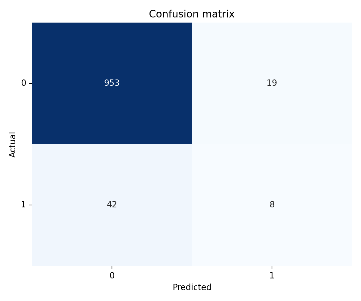
The random forest chose caution. The true-positive cell holds a small minority of actual cases, and the false-negative cell dominates. That is the opposite of what a screening classifier is supposed to do.
Why the random forest collapsed
This is the most instructive finding in the project and worth sitting with, because the intuition says the more flexible model should win.
Random forests can capture nonlinear interactions. With 100 trees and random feature subsets at each split, they have far more representational capacity than a linear boundary. Feature importance analysis on the trained ensemble confirmed that it was finding the right signal: age at importance 0.4067, average glucose at 0.1589, BMI at 0.1569, with hypertension and heart disease contributing smaller but nonzero shares. That is the correct clinical hierarchy. So the model was not failing to identify the risk factors.
It was failing to flag records.
Despite class_weight='balanced', tree-based ensembles build splits that maximize node purity using Gini or entropy criteria that are dominated by the majority class when the imbalance is this severe. Individual trees stay conservative about committing to a positive classification, and aggregating 100 conservative trees produces a conservative ensemble. The class weighting helps, but it does not fully counteract the tendency of trees to leave rare-class predictions on the table when feature distributions overlap between classes, which they heavily do in this dataset.
A shorter way to say the same thing: the tree ensemble was correctly rank-ordering records by stroke risk (ROC-AUC of 0.8124 confirms this), but the decision boundary was set far too conservatively for screening. Most of the actual positives were below that boundary, in the region the model treats as “probably negative.”
In principle, I could force more recall out of the random forest by post-hoc threshold tuning on the predicted probabilities. In practice, the calibration of tree-ensemble probability estimates is known to be uneven (Niculescu-Mizil & Caruana, 2005), and the linear model already reaches the target recall at a threshold the downstream stakeholder can reason about. That is why the rest of this post treats logistic regression as the answer and the random forest as the instructive failure.
Why logistic regression won
The linear boundary is not better because simple models beat complex ones in general. It is better because of what the two models do with the specific kind of signal this dataset offers.
Logistic regression produces probability estimates that are relatively well-calibrated out of the box, which matters because the threshold choice downstream is a meaningful one. When the model says 0.42, it roughly means a 42 percent estimated probability of stroke risk given the feature profile. A threshold shift from 0.5 to 0.3 moves the decision boundary in a way that the operator can reason about and communicate.
It also handles class weighting cleanly. The class_weight='balanced' setting multiplies each training example’s contribution to the loss by the inverse of its class frequency. For logistic regression, that is a proper reweighting of the objective function: the gradient updates respond to the reweighted loss, and the learned coefficients move in a direction that accounts for the minority class. The tree ensemble uses the same setting, but the criterion at each split still sees a majority-dominated sample, so the effect is diluted.
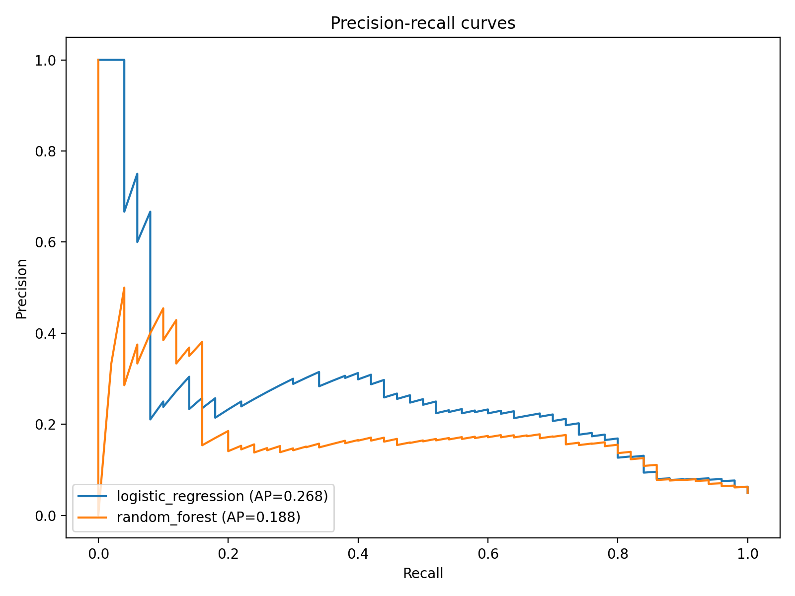
The precision-recall curve is a better frame than ROC when positives are rare. It shows the logistic regression maintaining usable recall across threshold choices while the random forest sits lower and flatter.
The model comparison chart aggregates both classifiers on the same axes.
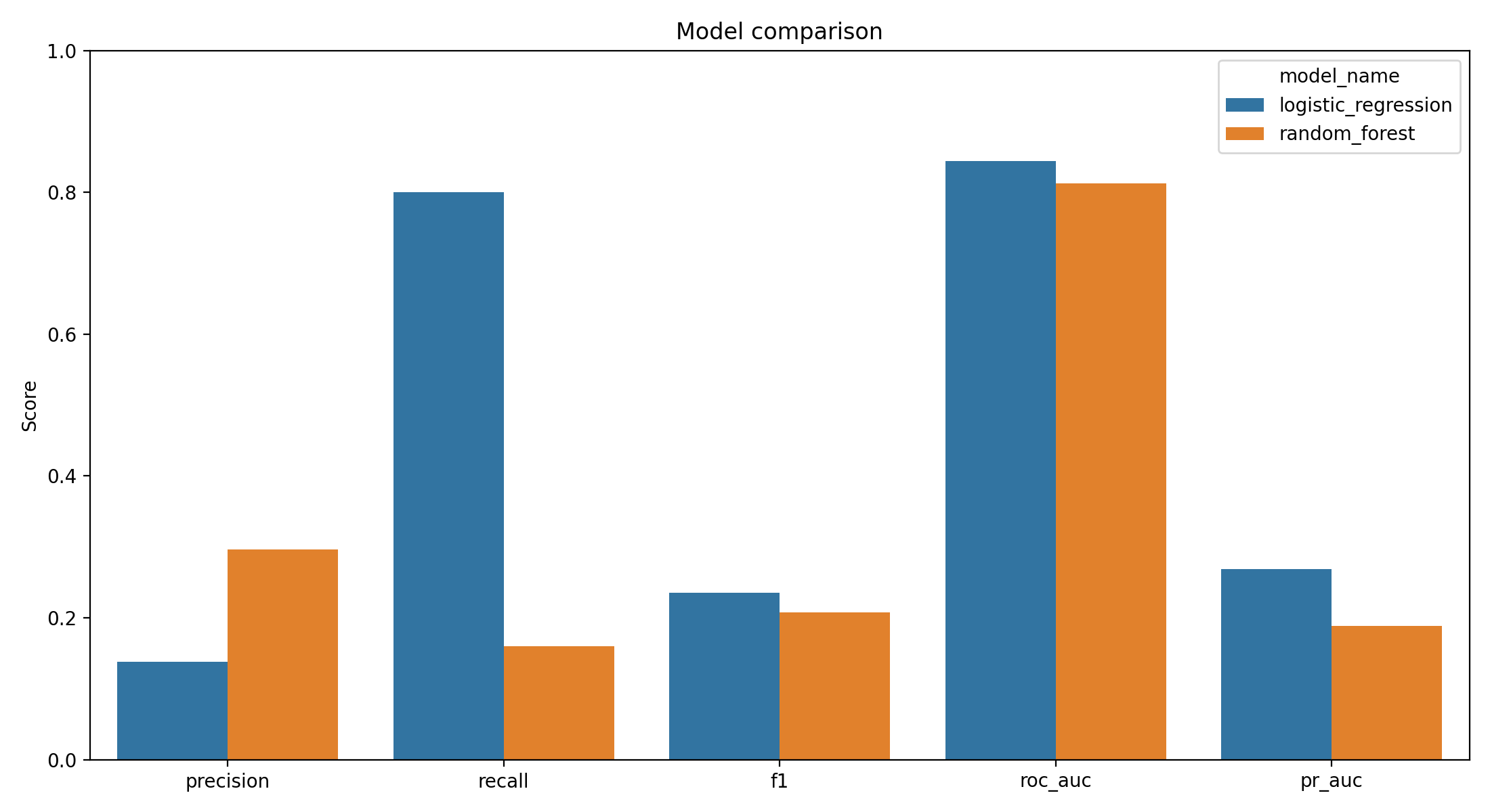
The recall bars make the central finding stand out. The simpler model recovers four-fifths of the positives; the more flexible model recovers roughly one-sixth.
The threshold is not a hyperparameter
This is the part of the project that took the longest to write clearly, because the instinct from most tutorials is to treat the 0.5 default threshold as a fact about the model. It is not. It is a convention, and it is the wrong one for screening.
The threshold is a workflow design decision, and the decision belongs to whoever owns the downstream process, not to the model.
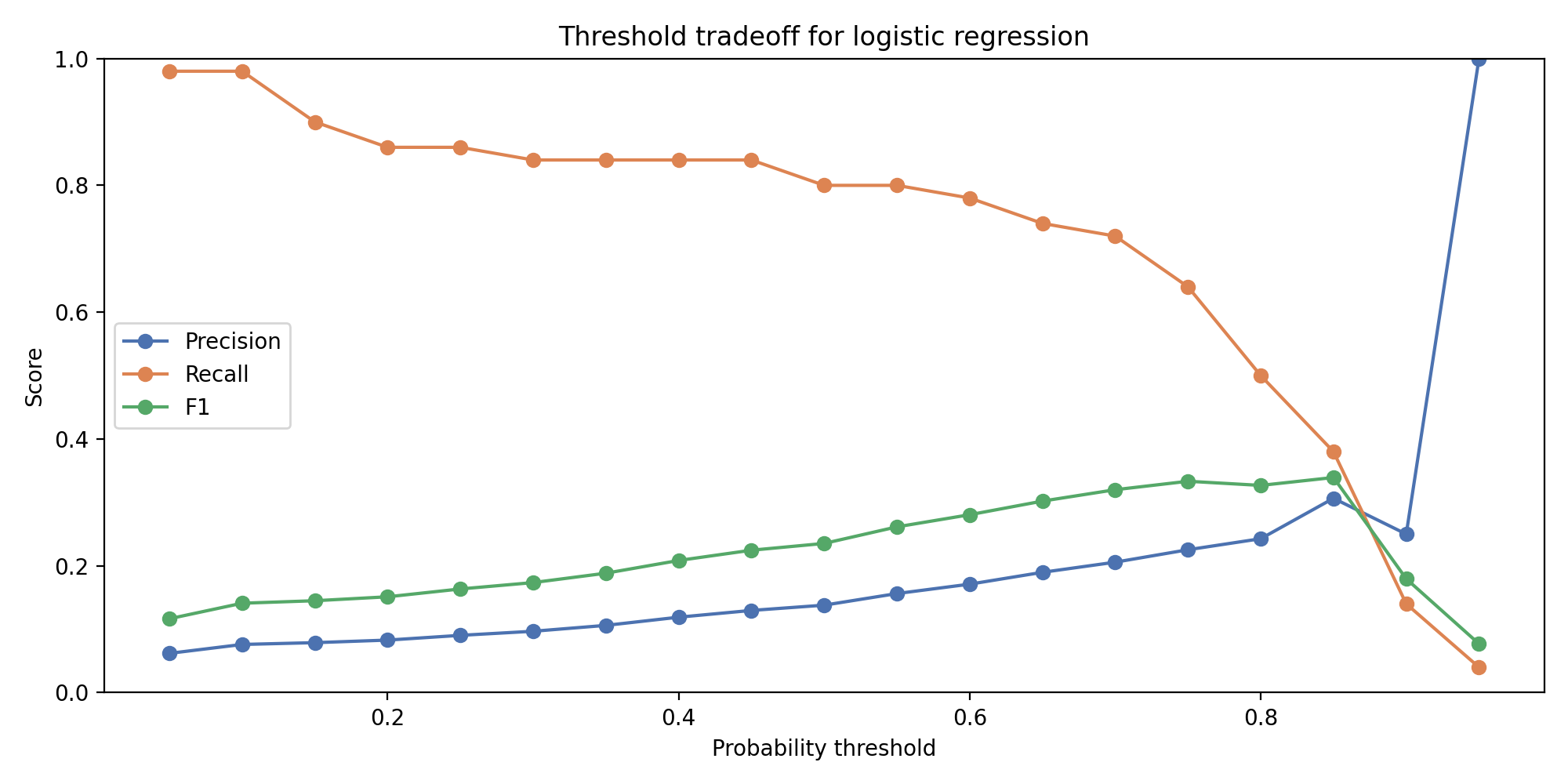
Recall and precision plotted as functions of the decision threshold. The 0.800 recall target crosses the curve at a threshold where precision has fallen into the 0.15 band. That precision value is the exact number the downstream stakeholder has to decide whether to accept.
At a threshold of 0.5, the logistic model’s recall is modest and precision is higher. At a threshold of 0.3 or below, recall climbs toward 0.80 and precision falls toward 0.15. The curve is smooth and monotonic across the relevant range, which is exactly the property that makes it useful as a design tool.
Whether 0.80 recall at 0.15 precision is acceptable depends on the workflow. In a primary care setting with capacity to follow up on flagged records, sending roughly six chart reviews for every one true positive is probably worthwhile — a chart review is cheap, a missed stroke is not. In a resource-constrained setting where every flagged record requires a specialist referral, the same tradeoff is prohibitive.
The model does not decide where to set the threshold. The threshold curve makes the decision legible.
The operational lens changes what “good performance” means. For a predictive analytics project where the downstream use is exploratory, a single point metric like F1 is reasonable. For a screening tool, the curve is the product. A single operating point is a design choice layered on top of it.
What this is not
A few honest limits that have to be named before anyone takes this further.
This is an educational demonstration, not a clinical tool. The dataset is publicly posted administrative data with unknown provenance — the original source attribution on Kaggle is thin, and there is no way to audit the data collection procedures. Any real deployment would need a dataset with documented provenance, proper institutional review, and a prospective validation plan.
The test set has 1,022 rows and approximately 50 actual positives. Confidence intervals on recall at that sample size are wide. An 0.800 recall observation means roughly 40 correctly flagged cases out of 50, and the difference between 0.74 and 0.86 recall could easily be sampling noise on a resample.
No cross-validation was run. A single stratified split, reported. That is a constraint of the test-set size rather than a methodological preference: repeated-k-fold or stratified cross-validation on a set this small produces fold-level recall estimates with even wider error bars, which would blur rather than clarify the central finding. A larger dataset would make cross-validation the obvious choice.
Finally, there is a methodological follow-up worth flagging. Class weighting is one approach to learning from imbalanced data, but not the only one. SMOTE (Chawla et al., 2002) generates synthetic minority-class examples by interpolating in feature space, and can sometimes recover more recall from tree-based models specifically by giving the trees more minority-class feature-space coverage to split on. He and Garcia (2009) catalog other options including cost-sensitive learning and focal loss variants. A comparison study that applied SMOTE, class weighting, and a cost-sensitive objective to both model families on this dataset would be the natural next step.
Reproducibility note
Everything in this post comes from a single pipeline that runs end-to-end from the Kaggle CSV through preprocessing, stratified splitting, both model fits, threshold analysis, and figure generation. Source code, the analysis notebook, and the figure outputs are in the public repository at github.com/ndjstn/stroke-risk-prediction. The dataset is the healthcare-dataset-stroke-data.csv file from the Kaggle stroke-prediction dataset (ranaghulamnabi, n.d.).